
This is a post that Merlin Mann would hate. In the so-called age of post productivity where tools don't mean as much as conquering meaningful work, I just can't help but notice the importance of something very tiny.
The input button on your iOS task manager.
That little plus thingee or inbox dodad that we sort of take for granted in our iOS apps. The deal is this: it actually matters more than you think and here's why: anything that helps you reduce friction will translate into greater productivity. If you want to input an idea very quickly, the button you press could make a big difference.
So let's take a look at a number of popular productivity apps and their iOS (and iPhone specifically) home pages.
Here we go!
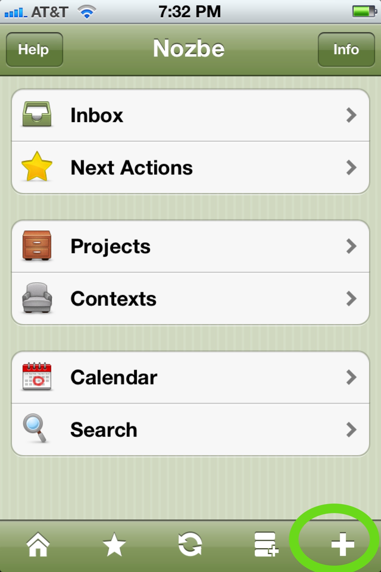
Nozbe: you'll notice that the input button is nicely placed to the bottom right of the screen. What Nozbe also allows is the three-stack button to its left which allows you to create a context or project as well just from the click of a button. My only complaint is that it doesn't really stand out from the other buttons. Grade: A-

The Hit List: while The Hit List isn't as intuitive as Nozbe or Omnifocus in terms of what's under the hood, the input button is nicely placed and overly large, to the top right of the screen. Still, it could stand out just a bit more. Grade: A-
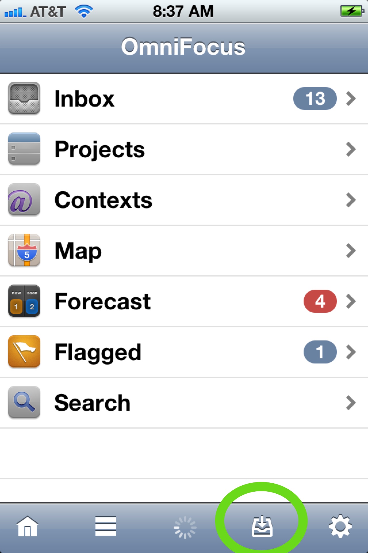
OmniFocus: the Ferrari of task managers has a different approach, offering an inbox instead of a plus sign. Those come as you go deeper into the application. I'd like to see the inbox either larger or a different color. Right now, it's sort of plane-Jane. The location is fine but it's just boring to look at. Grade: C+
Producteev: in my mind, the input button in Producteev is simply genius. It's large, placed in the center and really fun to use. All of the other developers should use Producteev for a week to see how much fun this input button is. Grade: A+
Remember the Milk: I like the layout of RTM's iOS home screen. It's clean and looks very nice. My only complaint is that it's all the way to the left. Grade: B
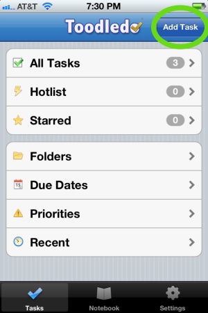
ToodleDo: While ToodleDo may not be as sexy as Producteev or as robust as Nozbe or OmniFocus, the input button is rectangular and to the top right. It feels great to use- simple as that. Grade: A
Conclusion: while this post may seem a bit over the top (I mean seriously, who else compares the input buttons in such detail?), it shows that details matter. If you feel good using a tool to get things done, you're more likely to use it again and most importantly, you will do more meaningful work.
Which application have you used and which feature do you enjoy the most?